Prescription Label Safety & Compliance Checker
Select the features present on your prescription bottle label to check for safety compliance.
Select options above to analyze your label's safety compliance.
RISK OF
OVERDOSE
Decoding the Bottle: Why Your Prescription Label Looks the Way It Does
You pick up your prescription. The bottle has a white label with black text, maybe a bright orange sticker slapped on top, and a barcode that looks like a maze of tiny lines. You nod at the pharmacist, pocket the bottle, and head home. But have you ever actually stopped to read what’s on there? Most people glance at the dosage-“Take one tablet twice daily”-and ignore the rest. That’s risky. Those extra lines of text, those specific font sizes, and those colored stickers aren’t just bureaucracy. They are life-saving signals designed to stop you from making a mistake.
The system behind these labels is messy. For years, every pharmacy, state, and chain had its own rules. One label might use bold red warnings; another might bury critical info in tiny gray text. This chaos led to confusion. In fact, medication errors caused by misreading labels are a major public health issue. To fix this, regulators like the Food and Drug Administration (FDA) and the United States Pharmacopeia (USP) have been pushing for standardization. If you want to stay safe, you need to know how to interpret the new standards hitting shelves right now.
The Push for Standardization: USP Chapter <17>
Back in 2012, the USP released General Chapter <17>, titled "Prescription Container Labeling." This was a big deal. Before this, labels were a wild west of designs. The USP noted that "wide variability in prescription container labels exists today across individual prescriptions, pharmacies, retail chains and states." That variability confused patients. So, they created a universal standard.
Here is what changed under USP <17>:
- Patient-Centered Layout: Labels must organize information based on how patients actually look for it. Dosage instructions come first, not buried at the bottom.
- Readability: Key information must use sans-serif typefaces (like Arial or Helvetica) because they are easier to read than fancy fonts. The minimum font size for essential info is 6 points, but warning text must be 8 points or larger.
- Contrast: Text and background colors must have high contrast. No more light gray text on white paper.
While these are voluntary guidelines at the federal level, many state boards of pharmacy have adopted them. This means if you live in a state that follows USP <17>, your label should look cleaner and clearer than it did five years ago.
Federal Rules vs. State Laws: A Patchwork System
Don’t assume the rules are the same everywhere. The FDA sets the baseline, but states often add stricter requirements. Currently, the FDA only strictly requires the patient’s name and dosage instructions on the label. Everything else varies.
Take Connecticut as an example. As of January 1, 2024, the state passed a law mandating fluorescent orange warning labels on all controlled substance and opioid prescriptions. These stickers must be exactly 1 1/4 inches in diameter. Why? Because opioids carry a high risk of overdose and addiction. The bright color grabs your attention immediately. You can’t miss it.
This creates a complex landscape. If you travel, your prescription label might look different depending on where you fill it. Some states require bilingual labels for Limited English Proficiency (LEP) patients. California, for instance, published translations of pill directions because surveys showed 47% of LEP patients struggled to understand standard instructions. Always check your local state board of pharmacy regulations if you manage medications across borders.
| Feature | Federal (FDA Baseline) | USP General Chapter <17> | State Example (Connecticut) |
|---|---|---|---|
| Mandatory Content | Patient name, dosage instructions | Standardized layout, high-contrast text | All federal requirements + specific warnings |
| Font Requirements | No specific mandate | Sans-serif, min 6pt (essential), 8pt (warnings) | Follows USP readability guidelines |
| Warning Stickers | Not mandated for general meds | Recommended for clarity | Fluorescent orange 1 1/4" sticker for opioids |
| Enforcement | Federal regulation (21 CFR Part 201) | Voluntary, adopted by states | State law enforcement |
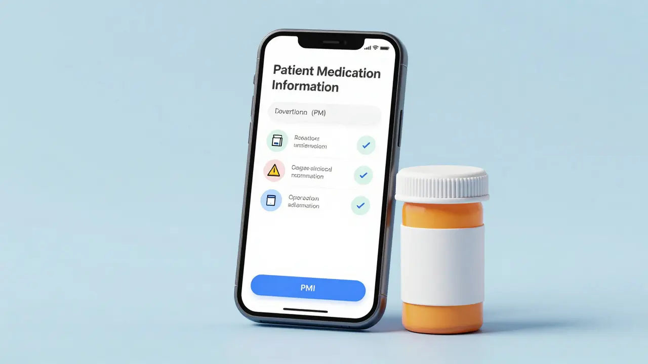
The New PMI Rule: What’s Coming in 2025?
The biggest change on the horizon is the FDA’s proposed Patient Medication Information (PMI) rule. Expected to be fully implemented by 2025, this rule aims to create a single-page standardized format for all prescription drugs. Think of it as the nutrition label for your medicine.
Currently, drug inserts are long, legalistic documents filled with jargon. The PMI rule strips that away. It focuses on:
- Essential Instructions: How to take the drug clearly.
- Safety Warnings: What side effects to watch for.
- Adverse Events: When to call the doctor.
This shift addresses a critical gap. Older adults, who often manage multiple medications, struggle with small fonts and poor contrast. AARP’s 2023 survey found that 68% of adults aged 65+ have difficulty reading standard labels. The PMI rule uses plain language and consistent formatting to help them. It’s not just about compliance; it’s about reducing hospital visits caused by simple misunderstandings.
Reading the Barcodes and Technical Specs
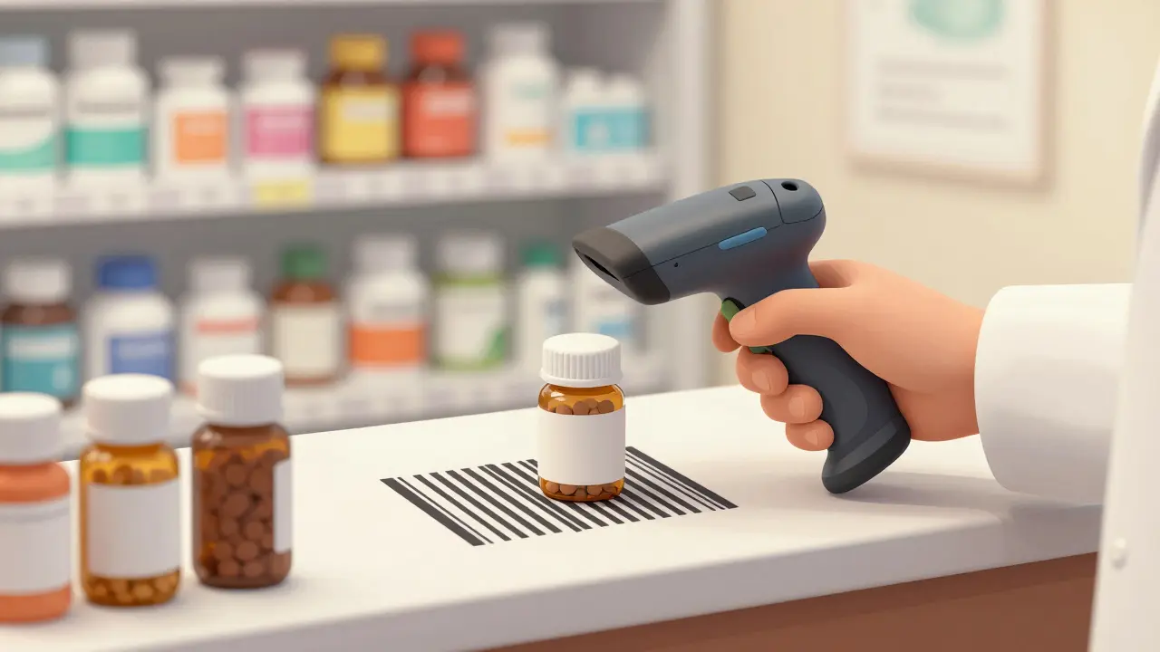
You see barcodes on everything now, including your pills. These aren’t just for inventory. Under 21 CFR Part 201, GS1 DataMatrix and Code 128 barcodes are required on prescription labels. They encode the National Drug Code (NDC), lot numbers, and expiration dates.
Why does this matter to you? Because pharmacists scan these codes before handing you the bottle. Automated verification systems check the barcode against your prescription order. If the scan fails, the pharmacist knows something is wrong. This double-check process catches errors where the wrong drug might have been picked. However, the print quality matters. The standards require Grade C or higher print quality. If the barcode is smudged or faded, it won’t scan, delaying your pickup. Keep your labels clean and dry.
Warning Stickers: More Than Just Color
Warning stickers serve a specific purpose: they flag high-risk medications. Beyond Connecticut’s orange opioid stickers, you might see other colors or symbols. Companies like PDC Healthcare produce specialized labels, such as “CAUTION: OPIOID Risk of Overdose and Addiction” stickers. These are usually red with white text, measuring precisely 1-9/16" x 3/8".
When you see a warning sticker, pause. Read it. These stickers indicate:
- High Potency: The drug is strong and has a narrow therapeutic index (small difference between helpful dose and harmful dose).
- Dependency Risk: The medication can cause addiction.
- Severe Side Effects: There are serious risks like bleeding, drowsiness, or heart issues.
Ignoring these stickers is dangerous. In community pharmacies, similar drug names printed in small font with poor contrast contributed to 12% of reported medication errors in 2022, according to the Institute for Safe Medication Practices. A warning sticker breaks the visual pattern, forcing you to pay attention.
Practical Tips for Patients
So, how do you use this information? Here is a quick checklist for when you pick up your next prescription:
- Check the Font Size: If you can’t read it without squinting, ask for a reprint or request large-print labels. Many pharmacies offer this free.
- Look for the Orange Sticker: If you get a controlled substance, ensure the fluorescent orange sticker is present if you’re in a state like Connecticut. It’s a safety net.
- Verify the Barcode Scan: Watch the pharmacist scan the bottle. If they hesitate or re-scan, ask why. It could mean a mismatch.
- Ask About Multilingual Options: If English isn’t your first language, ask if the pharmacy provides translated instructions. California and other states mandate this for certain populations.
- Review the Expiration Date: Ensure the date on the label matches the vial inside. Never take expired medication.
Industry Impact and Future Trends
This regulatory push is reshaping the pharmacy industry. The market for pharmaceutical labeling solutions is growing fast, projected to reach $3.4 billion by 2027. Why? Because pharmacies have to upgrade their technology. Small independent pharmacies may spend $5,000 to $15,000 on new barcode scanners and label design software to meet the 2025 PMI standards.
Technology is also changing how we interact with labels. QR codes are appearing on 18% of prescription labels, linking to video instructions. Imagine scanning a code on your bottle and watching a 30-second video showing exactly how to use an inhaler. By 2027, experts predict 75% of labels will include augmented reality features accessible via smartphone. This bridges the gap between static text and dynamic understanding.
For patients, this means better adherence. When you understand how to take your medicine, you’re more likely to take it correctly. The National Academy of Medicine calls standardized labeling "one of the highest-impact, lowest-cost interventions available to reduce medication errors." It’s a win for everyone.
What is the USP General Chapter <17>?
USP General Chapter <17> is a set of standards released in 2012 that defines how prescription labels should look. It mandates sans-serif fonts, minimum font sizes (6pt for essential info, 8pt for warnings), and high-contrast colors to improve readability and reduce medication errors.
Why do some pharmacy labels have orange stickers?
Orange stickers are often used for controlled substances, particularly opioids. In states like Connecticut, laws mandate fluorescent orange warning labels (1 1/4 inch diameter) on opioid prescriptions to alert patients to the risks of overdose and addiction.
What is the FDA's PMI rule?
The Patient Medication Information (PMI) rule is a proposed FDA regulation expected to be implemented by 2025. It aims to standardize prescription labels into a single-page format focusing on clear, patient-friendly instructions and safety warnings, replacing complex legalistic inserts.
Are pharmacy label standards the same in every state?
No. While the FDA sets federal baselines, states can impose stricter rules. For example, Connecticut requires specific opioid warning labels, and California mandates multilingual options for LEP patients. Always check your local state board of pharmacy regulations.
How do barcodes on prescription labels help patients?
Barcodes encode the National Drug Code (NDC), lot number, and expiration date. Pharmacists scan these to verify the correct medication was dispensed. This automated check helps prevent dispensing errors, ensuring you get the right drug and strength.
