Every year, thousands of medication errors happen because two drug names look or sound almost the same. tall-man lettering isn’t magic-it’s a simple, proven way to make those confusing names stand out before someone grabs the wrong bottle, prescribes the wrong dose, or administers the wrong drug.
What Tall-Man Lettering Actually Does
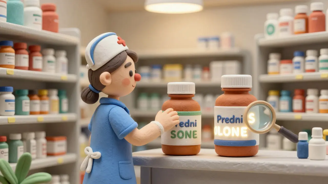
Tall-man lettering is just capitalizing certain letters in similar drug names to highlight the differences. It turns prednisone and prednisolone into predniSONE and predniSOLONE. The capitalized parts-SONE and SOLONE-jump out visually. You don’t have to read the whole name. Your eyes catch the difference before your brain even has time to get confused.
This isn’t about making names harder to read. It’s about making the right choice easier. In a busy hospital pharmacy, a nurse might have 10 minutes to grab 15 medications. Under pressure, your brain defaults to shortcuts. Tall-man lettering blocks those shortcuts from leading you astray.
The Institute for Safe Medication Practices (ISMP) started pushing this method in 1999. By 2001, the FDA had launched its own Name Differentiation Project. Today, nearly 9 out of 10 U.S. hospitals use it. Australia, New Zealand, and parts of Europe follow similar standards. It’s not optional anymore-it’s part of the baseline safety infrastructure.
How It Works in Real-World Examples
Here are a few real pairs where tall-man lettering makes a difference:
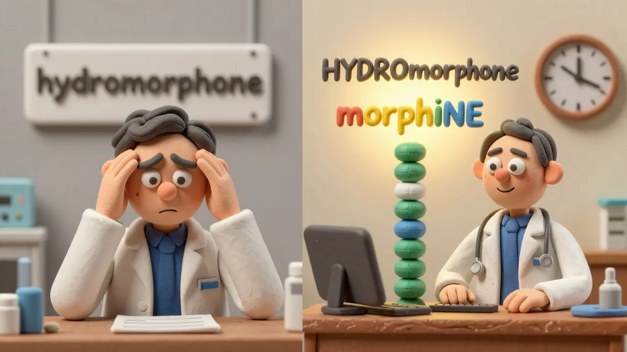
- HYDROmorphone vs. morphINE - The HYDRO and INE stand out clearly.
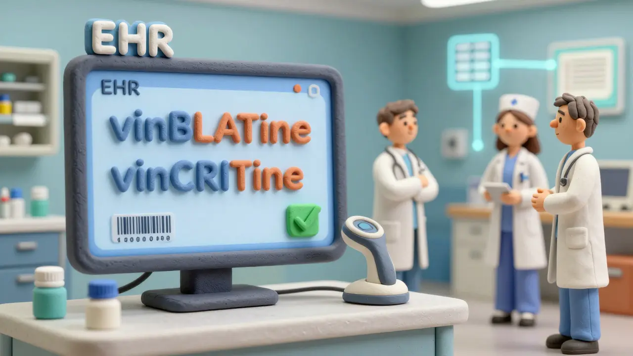
- vinBLAStine vs. vinCRIStine - The BLAST and CRIS sections break the visual similarity.
- CISplatin vs. CARBOplatin - The CIS and CARBO are impossible to miss.
- ALPRAZolam vs. LORazepam - The ALPRAZ and LOR create clear visual separation.
These aren’t theoretical. A 2004 eye-tracking study by ISMP showed that when pharmacists and nurses saw tall-man lettering, they made 35% fewer selection errors in simulated scenarios. That’s not a small number-it’s life or death.
Even small changes matter. One nurse in a Bristol hospital told me she used to double-check every time she pulled fluoxetine and paroxetine. After tall-man lettering was added to their EHR system, she stopped. Not because she was careless-but because the difference was now obvious. She saved 20 seconds per dose. Multiply that by 50 doses a day, and you’ve got hours saved every week.

Where It’s Used-and Where It Fails
Tall-man lettering isn’t just on labels. It’s built into:
- Electronic health records (EHRs) like Epic and Cerner
- Automated dispensing cabinets (Pyxis, Omnicell)
- Prescription printouts and e-prescriptions
- Drug databases and pharmacy software
But it doesn’t work everywhere. If two drugs start the same way-like metoprolol and methyldopa-capitalizing the end letters won’t help. The confusion happens at the beginning, where your eyes land first. In those cases, tall-man lettering does almost nothing.
Another problem? Inconsistency. One hospital uses oxyCODONE, another uses OXYcodone. A community pharmacy might not use it at all. When you move between systems, the visual cues disappear. A 2023 survey found 63% of pharmacists said inconsistent application across systems made things worse, not better.
And it’s not a cure-all. A 2016 study in Pediatrics claimed tall-man lettering didn’t reduce errors in children’s hospitals. But that study didn’t verify whether the hospitals actually implemented it correctly. Later reviews, including a 2022 Cochrane analysis, found moderate certainty it reduces selection errors-but low certainty it reduces actual harm. That’s because it’s just one layer. It needs help.
How to Implement It Correctly
If you’re trying to roll this out in your pharmacy or hospital, here’s how to do it right:
- Start with the right list. Use ISMP’s quarterly updated list of 252 drug pairs, not random guesses. The FDA’s list of 72 is a good start, but ISMP’s is more comprehensive.
- Apply it everywhere. If you use it in your EHR but not on printed labels or automated cabinets, you’re creating confusion. Consistency is non-negotiable.
- Use the right font. Some fonts make capital letters look too small or too similar to lowercase. Test it. Use a clear, sans-serif font like Arial or Helvetica. Avoid script or decorative fonts.
- Train everyone. Nurses, doctors, pharmacists, and even administrative staff need to know why it’s there. Show them before-and-after examples. Let them feel the difference.
- Monitor and adjust. Track how many LASA-related alerts are being overridden. If errors drop after implementation, you’re on track. If they don’t, check whether the capitalization is even being applied correctly.
One hospital in Leeds implemented this across 13 systems for 210 drug names. It took 16 weeks. The IT team worked with the pharmacy safety officer. They tested every screen, every label, every printout. Six months later, overridden alerts for similar drugs dropped by 42%. That’s not luck-that’s method.

Why It Still Matters in a High-Tech World
You might think barcode scanning and AI alerts make tall-man lettering obsolete. But here’s the truth: technology fails. A barcode gets smudged. A system crashes. An alert pops up 50 times a shift, and people start ignoring them.
Tall-man lettering works even when everything else breaks. It’s visual. It’s immediate. It doesn’t need power, Wi-Fi, or a login. It’s there on the screen, on the label, on the printout-always.
Even Epic Systems, which now uses AI to predict error-prone drug pairs, still relies on tall-man lettering as its first line of defense. Their pilot in 15 hospitals showed AI-enhanced tall-man lettering reduced selection errors by 29% more than standard versions. The AI didn’t replace the letters-it made them smarter.
Dr. Michael Cohen from ISMP says it best: “Tall-man lettering isn’t a panacea, but it’s one essential layer.” You wouldn’t skip a seatbelt because your car has airbags. Same here.
What’s Next for Tall-Man Lettering
The FDA and ISMP are finally working together to unify their lists. A single, national standard is coming in 2024. That’s huge. No more confusion over whether it’s oxyCODONE or OXYcodone.
Australia just added 12 new drug pairs to their list in March 2023 based on real near-miss reports. The UK’s NHS is expanding its use beyond hospitals into community pharmacies. And smaller clinics? They’re catching up. The cost? Around £1,000 per system. That’s less than one nurse’s shift. The return? Lives saved.
Will it last? Yes. Even as voice-controlled prescribing and robotics grow, human eyes will still scan screens. Human hands will still pick up bottles. And as long as drug names are confusing, we’ll need something simple to cut through the noise.
Tall-man lettering isn’t flashy. It doesn’t make headlines. But every time it stops someone from grabbing the wrong drug, it’s doing its job.
What is tall-man lettering?
Tall-man lettering is a typographic method that uses selective capitalization in drug names to highlight differences between look-alike, sound-alike (LASA) medications. For example, writing "predniSONE" and "predniSOLONE" helps users visually distinguish between prednisone and prednisolone, reducing the chance of medication errors.
Which organizations recommend tall-man lettering?
The Institute for Safe Medication Practices (ISMP) and the U.S. Food and Drug Administration (FDA) are the primary advocates. Australia’s National Mixed-Case Lettering List and the UK’s NHS also endorse its use. The American Society of Health-System Pharmacists (ASHP) gives it a Grade B recommendation as part of a broader safety strategy.
Does tall-man lettering actually reduce errors?
Yes, in controlled settings and real-world use. A 2004 ISMP eye-tracking study showed a 35% reduction in selection errors. Hospitals that implemented it fully, like one in Leeds, saw a 42% drop in overridden LASA alerts. However, it’s most effective when used alongside other safety measures like barcode scanning and double-checks.
Why do some people say tall-man lettering doesn’t work?
Some studies, like a 2016 Pediatrics study, claimed no benefit-but they didn’t verify whether tall-man lettering was properly implemented. The real issue is inconsistency: if one system uses "HYDROmorphone" and another uses "hydroMORPHONE", it confuses users. When applied uniformly, the evidence supports its effectiveness.
What drugs are most commonly mixed up?
Common pairs include: hydromorphone vs. morphine, prednisone vs. prednisolone, vinblastine vs. vincristine, cisplatin vs. carboplatin, alprazolam vs. lorazepam, and fluoxetine vs. paroxetine. These are all on ISMP’s official list of 252 high-risk pairs.
Can I use tall-man lettering in my private practice?
Yes. Even small clinics can use it in electronic prescribing systems, printed prescriptions, and medication lists. Start with ISMP’s free list of high-risk pairs. Update your templates and train your staff. It doesn’t require expensive software-just attention to detail.

